
FINCH
UX Designer
Effortless Finance
Money management with a Streamlined e-Wallet App
- Case study
Overview
Designing a web-based solution to simplify personal finance management with features for budgeting, payments, and transfers.
methodologies
User Interviews
Surveys
Competitive Analysis
User Journey
Card Sorting
Usability Testing
1/9
The problem

Empowering users to better track, send and spend their money.
THE WHAT:
While cash still plays a role in some transactions, the demand for convenient and efficient financial management tools is growing. Existing solutions often lack user-friendly features for easy expense tracking, peer-to-peer money transfers, and seamless purchasing experiences.
THE GOAL:
Design a user-friendly mobile-first application that empowers users to effortlessly track their spending, send money to friends securely, and make purchases with ease.
MY ROLE:
As UX Designer, I spearheaded the entire design process - from initial concept development to the creation of high-fidelity mockups for the final application.
2/9
the framework

Empathize
User Interviews
Surveys
Competitive Audit
Ideate
Card Sorting
User Flows
Prototype
Wireframes
Prototypes
Test
Usability Testing


Understanding the competitive landscape: a user-centered approach
Why a competitive analysis?
Competitive analysis helps us learn from others' successes and failures. By studying competitors, we can identify user-valued features, avoid common pitfalls, and craft a unique value proposition for our design.
Asking the right questions:
Who are the key players? Identifying major competitors allowed us to benchmark their offerings.
What functionalities do they offer? Analyzing existing features helped us understand user needs and identify potential gaps in the market.
How are they perceived by users? Evaluating user reviews and app store ratings revealed user preferences and pain points regarding communication style and overall experience.
User-Friendly Finance over Financial Jargon:
Transparency is Key: Users value clear upfront pricing and real-time transaction updates, which builds trust and a sense of security.
Simplifying Finance: Financial language can be complex and off-putting. We saw an opportunity to create a user-friendly experience that simplifies financial management without the "stodgy-ness" often associated with traditional finance apps.

Research - uncovering needs and opportunities
Why Combine Qualitative & Quantitative Methods?
Combining qualitative and quantitative data provided a deep understanding of user behaviors and motivations related to financial apps and payments.
Research Goals:
Understand user behavior: We explored how users interact with payment apps and the contexts surrounding their usage.
Identify pain points: By listening to user experiences, we aimed to uncover frustrations associated with existing financial tools.
Discover desired features: Understanding user needs helped us identify valuable features for our application.
Unlocking a Gap in the Market:
Demand for Budgeting Tools: A surprising discovery was the strong user interest in budget or financial tracking functionalities within the app. Users valued the ability to visualize spending habits and manage budgets through graphical interfaces. This finding highlighted a potential gap in the market for a user-friendly budgeting solution.
Future Feature Exploration: While international transfers fell outside the scope of this project, user interest in this area presented an opportunity for future product development.
Simplicity is Key: Users emphasized the importance of a streamlined data entry process and a smooth onboarding experience. "Simple" was a recurring keyword throughout the interviews.

4/9
MAKING USERS...HUMAN!

Personas and user journeys - bringing users to life
Why Personas and User Journeys?
Personas and user journeys offer a human-centered approach to design. Personas create realistic user profiles, guiding decisions based on user needs, while journey maps visualize how users interact with the product, revealing opportunities and pain points.
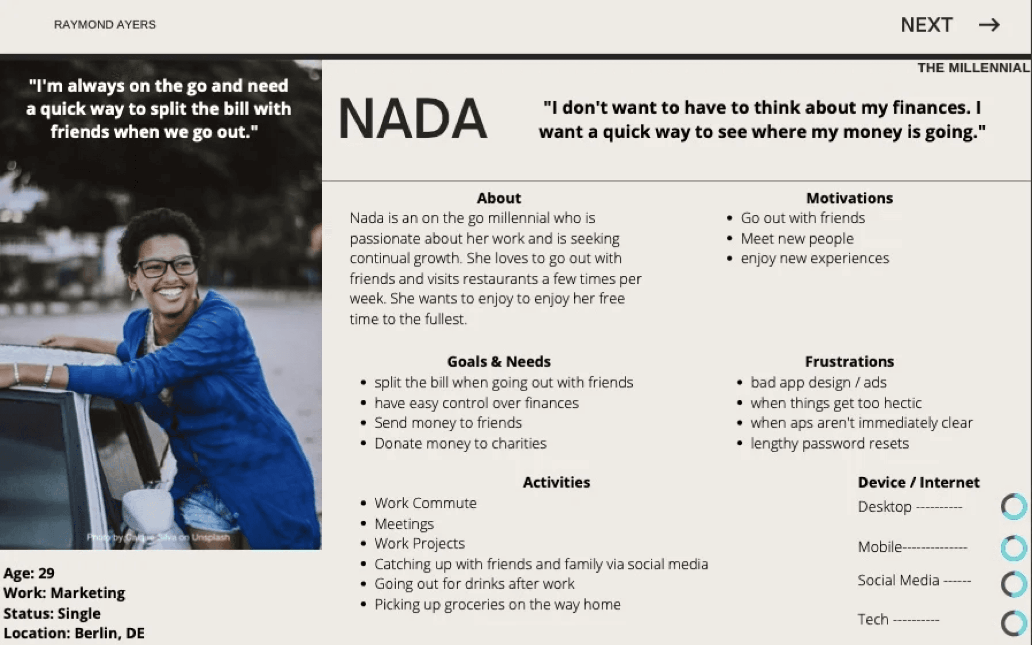
Meet Nada & Günther: Our Target Users:
The research identified two distinct user types:
Nada: A young, single professional who enjoys an active social life. She desires a user-friendly way to track her spending and manage her finances.
Günther: A family man seeking a more efficient way to manage credit cards, simplify payments, and track household expenses.
User needs in focus:
Developing these personas fostered a deep sense of empathy and clarity. By humanizing our target audience as Nada and Günther, their needs remained at the forefront of every design decision. This user-centric approach provided a solid foundation for creating a financial management app that caters to both Nada and Günther's specific needs.
5/9
idiation Nation...


Information architecture: building a user-friendly navigation
Why Card Sorting and Sitemaps Matter:
Card sorting and site-maps allow us to understand how users naturally organize information, enabling us to create an intuitive app structure that users can navigate with ease. This helps avoid costly redesigns later and streamlines the development workflow, saving time and resources.
Refining the User Journey:
Iterate on Site Structure: Through card sorting sessions, we evaluated different layouts and identified the most intuitive arrangement for users.
Refine Labeling: We tested various labels for app functionalities to ensure clear and user-friendly terminology.
Frictionless Money Transfer and Streamlined Navigation:
Money Sending: User testing revealed a need for a more intuitive money-sending experience, especially for new users. This was addressed by integrating the functionality into two key areas:
Contacts Page: Users can now easily send money directly from their contact list.
P2P Transaction Flow: The money transfer option is readily available when initiating a peer-to-peer transaction.
Navigation and Settings
The navigation was streamlined by removing the "wallet" label and placing "send" and "receive" options directly within the menu for easier access.
Based on user feedback, a dedicated notification icon was implemented on the home screen to provide quick access to notification settings, previously buried within the general settings menu.
6/9
PUTTING IDEAS ON THE CANVAS
Wireframing: building the app's foundation
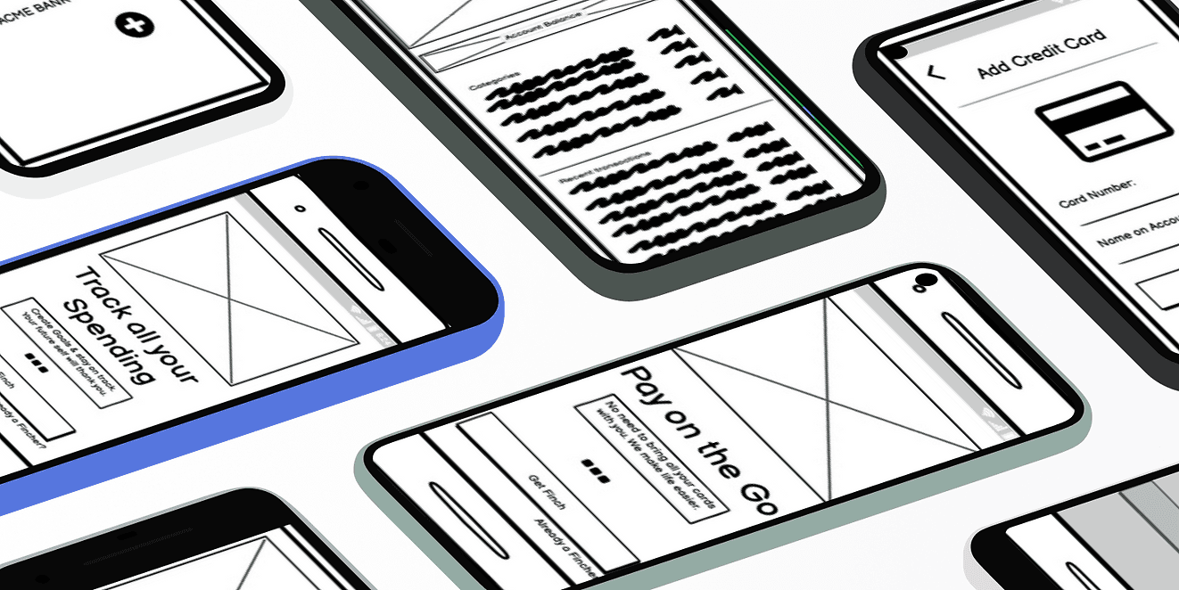
Why Wireframes Matter:
Wireframes facilitate rapid iteration and early detection of usability issues. They prioritize core functionality, align stakeholders, and provide a visual foundation for the design process.
The Wireframing Process:
Prioritizing Usability: A core goal was to ensure users could easily complete key tasks within the app's core functionalities. Usability testing with target users played a critical role in identifying areas for improvement.
Gathering Stakeholder Feedback: Valuable input from stakeholders helped refine the wireframes and ensure alignment with project goals.
Mobile-First Design for a Seamless Experience:
Mobile-First Design for All Devices:
To ensure a smooth user experience across all screen sizes, a "mobile-first" approach was employed. The navigation menu was placed at the bottom for optimal usability on mobile devices and gracefully transitions to a top position on tablets and desktops.
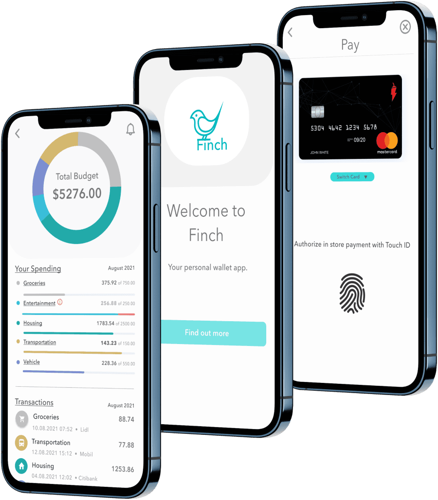
From Wireframes to Finch:
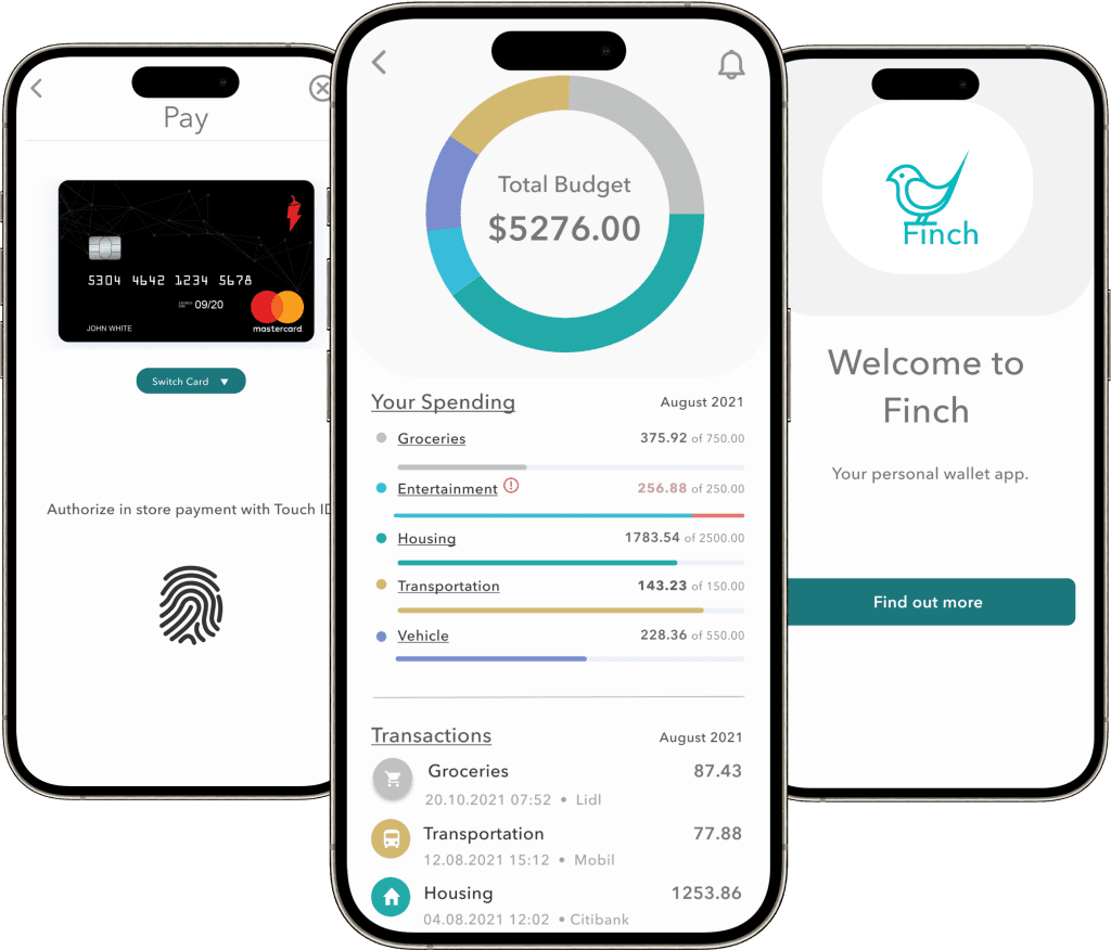
Mid-fidelity wireframing not only solidified the app's structure but also yielded its name: Finch. This stage allowed for design exploration alongside usability testing. Valuable user feedback identified areas for improvement, which we'll discuss next.

— Paul Arden
7/9
failing towards excellence

Usability testing - refining the design through user feedback
Why Usability Testing Matters:
Usability testing reveals user pain points early for quick design adjustments, offering a cost-effective path to product improvement.
Planning, Observation, and Analysis:
Planning & Scripting: A documented test plan outlined objectives, methodology, and recruitment criteria. A test script ensured consistent execution across all participant sessions.
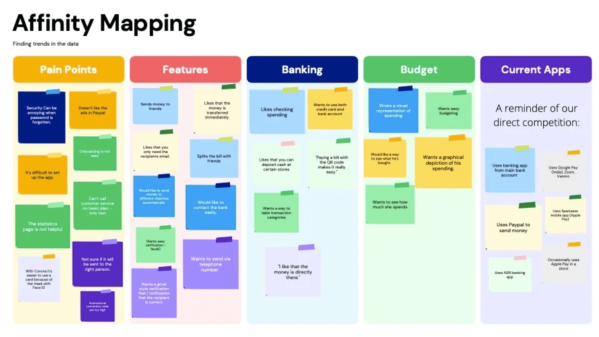
Data Collection & Evaluation: Following the testing sessions, findings and user feedback was documented. Usability issues were rated using Nielsen's Severity Scale to assess their impact.
Data Organization: To identify patterns and prioritize user feedback, two key techniques were employed: Affinity Mapping, a visual approach for uncovering themes, and the Rainbow Spreadsheet, which allowed categorization and prioritization of feedback based on various criteria like frequency and severity.
Addressing Issues and Refining the Design:
Prioritizing Accessibility: The initial font choice, while aesthetically pleasing and trendy, lacked readability for some users. This was addressed by selecting a heavier, user-friendly font that prioritized accessibility.
Dedicated Budget Page: User feedback revealed the need for a designated "Budget" page separate from the "Home" page. This separation provided users with a focused space to track their spending and manage their finances.
Enhancing Onboarding: Usability testing exposed issues with the onboarding process. Transaction details were missing from confirmation screens, and some users inadvertently skipped onboarding pages. To address this, the onboarding process was improved by adding missing information and creating clearer visual cues to guide users through each step.
8/9
HEY, GOOD LOOKIN’
THE WHAT:
High-fidelity wireframes were transformed into polished mockups that incorporated the following design principles:
Visual Design Principles & Grids: Design principles and grid systems were applied to ensure a visually appealing and consistent interface.
Emotional Design: Emotional design principles were integrated to enhance user engagement with the app's functionalities.
WCAG Compliance: Web Content Accessibility Guidelines (WCAG) from Section 508 were strictly adhered to, ensuring an accessible user experience for all.
Enhanced User Onboarding and Security:
What’s next? Based on ongoing user testing, the following areas were identified for further refinement:
Post-Login Onboarding: To help users grasp the app's functionalities more effectively, "post-boarding" tutorials will be created after the initial login process. Coach marks may be a suitable approach for this purpose.
Integrated Onboarding for Key Actions: Certain processes, like adding a credit card, could be seamlessly integrated into the initial onboarding flow for an even more streamlined experience.
Robust Security Measures: While initial security elements have been implemented, a comprehensive security plan is essential. This plan will address login security, two-factor authentication, purchase security, and user awareness initiatives.

Retrospective - learnings and improvements
What Worked Well:
Achieving Core Goals: The project successfully delivered its core functionalities, enabling users to send money to friends and manage their credit cards efficiently.
Data-Driven Design: By iterating based on user data, a strong user demand for money tracking functionality was identified. Integrating this feature not only enhanced the app's value proposition but also uncovered a potential niche in the market.
Areas for Improvement:
Card Sorting Approach: Utilizing an open card sort from the outset would have provided users with more freedom to categorize functionalities, potentially leading to more efficient navigation label discovery.
Enhanced Competitive Analysis: Expanding the scope of the competitive analysis to international organizations would offer a more comprehensive understanding of the financial app landscape in future projects.
Prioritizing Information Architecture: Utilizing both open and closed card sorts during the early stages could have reduced rework and save resources in the development process. This will be a key focus in future projects where a card sort is needed.
Thanks for stopping by! Drop me a line.